master bedroom refresh + a corner for baby
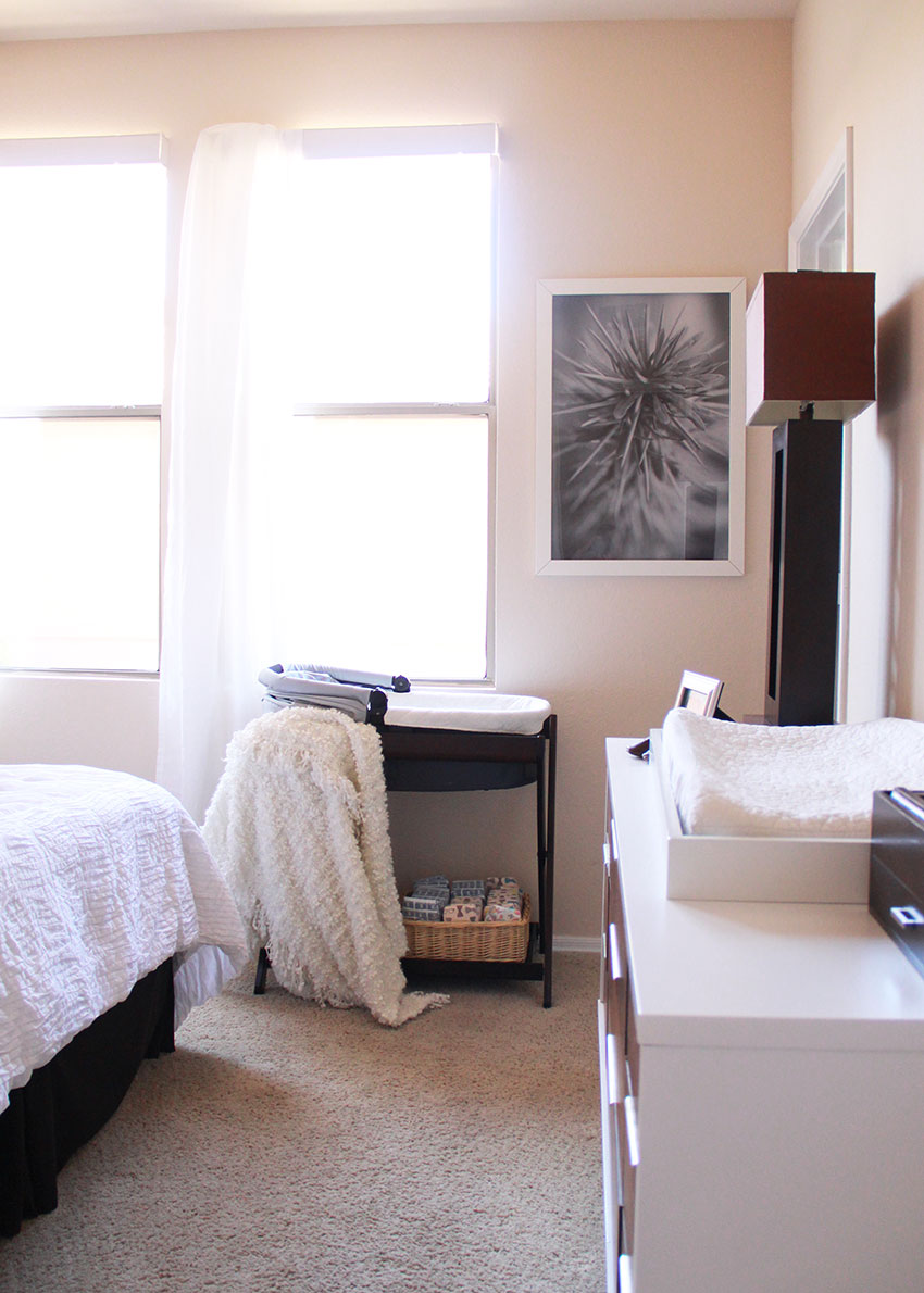
As you may have noticed from some of my recent posts, I am in major nesting mode right now. Less than two weeks to go until my due date and I feel like I am just now coming to grips with the fact that we will have an entire other [tiny] human living with us in our small apartment.
We were actually in a similar situation when my oldest was born. At the time, my husband and I lived in a two bedroom apartment in LA with my sister. Because it was LA and money was tight for all of us, we agreed that the baby would stay in our room so my sister could keep living with us for as long as that worked for everyone. And we ended up making it work for a year. Then when my daughter was born, my sister [who just so happens to be an interior designer] and I got to have our fun designing a nursery/big boy room for the two kiddos to share. Now, here we are in a new city and a different apartment, and the people living in our second bedroom are that not-so-baby boy and my daughter, so again, the baby will stay in our room for some time until we can get a bigger space.
Because we are planning to buy a house next year, I really didn’t want to buy a bunch of new stuff. Also, we have a lot of baby essentials, given the fact that this is baby number three. But I am never one to turn down a project, especially when I’m in nesting mode. And I have been meaning to update our bedroom a while now since we moved here (back in December) anyway, so I have been doing it bit by bit, as I find things I love. Then I was on Pinterest, and I found this image that inspired me and made me realize that even though I don’t get to design a full nursery right now, I can still update our space to make it feel more ‘ready’ for baby. So this project is still very much a work in progress.
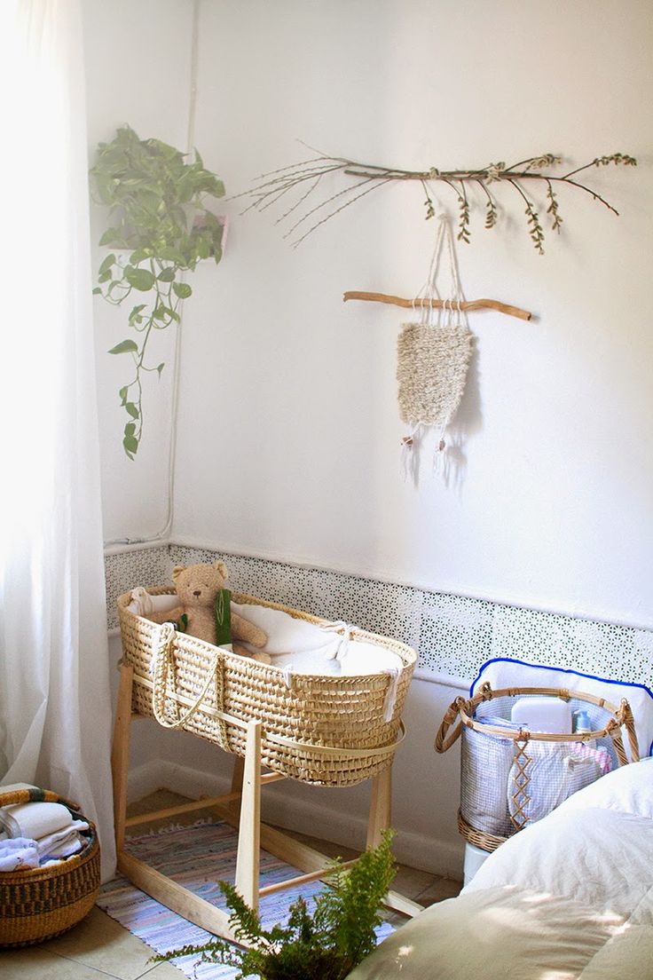
Like, I really wish I had this Moses basket/bassinet situation going on right now. But since we already have our UPPAbaby bassinet that came with our VISTA stroller and bassinet stand
, we will just have to make that work for now.
I usually hate to share any pictures of projects I don’t feel are ‘done,’ but to be honest, this one probably won’t be done for a while. Like until after we move into our own house and have some flat, non-textured walls that I can paint white [for the record, I HATE this current paint color, but we are not allowed to change it]. So I’m also going to share some more of my inspiration as well as these actual pictures of our room. These ideas will eventually fill in some of the areas around the room that need it. And then maybe I will do an updated post later with my finds!
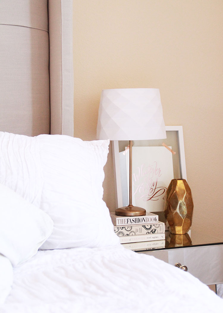
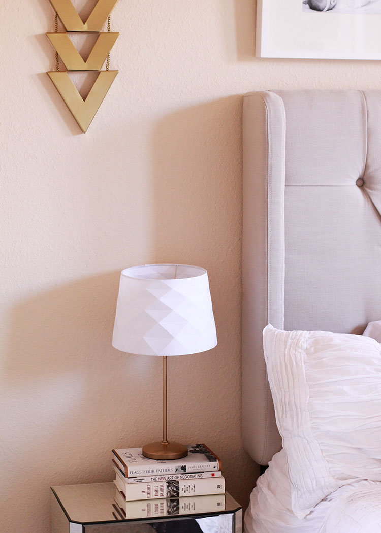
I bought these fun lamp shades a while back to add to our existing lamp bases and I was intending to buy new lamp bases later. But after shopping around, I couldn’t find simple gold ones that I liked in my budget. So I just spray painted these (that used to be antique silver color) gold and styled some books underneath each of them to give them some extra height. The mirrored side tables I found at Target a few months back too.
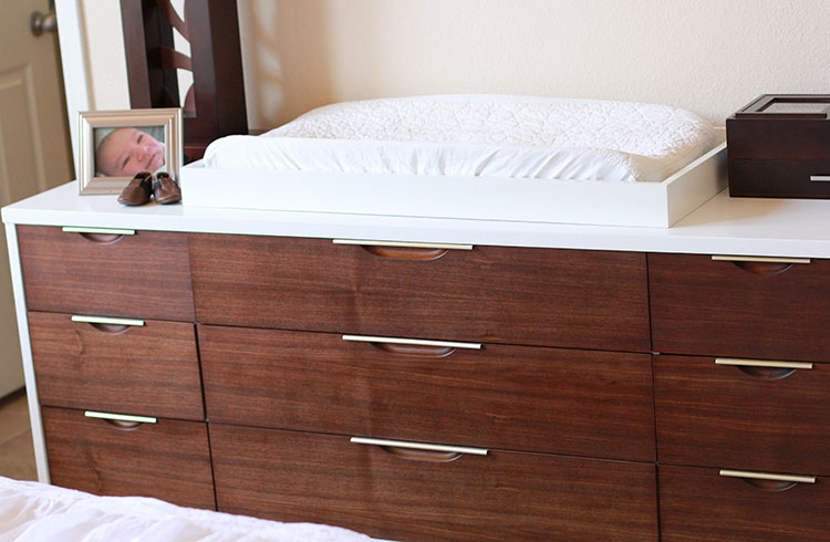
One thing we splurged on that we actually did really need was this gorgeous dresser. The baby’s stuff will go in here too, for now, and our old dresser was falling apart and just generally too small to cram any more stuff in. This one is actually an original Kent Coffey mid-century modern dresser from the 1960s that has been beautifully refinished. I found it on craigslist for an amazing price [even lower than some of the bigger chain retailers with similar knock-off style pieces]! I put the change top we already had on here and it works perfectly.
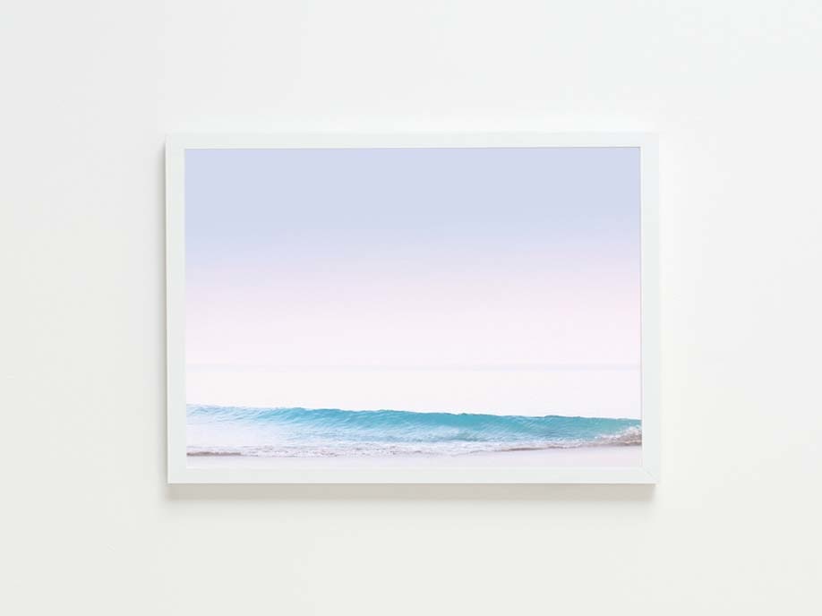
Above the dresser is just a blank space for now. I would die for an oversize farmed print from Max Wagner here such as
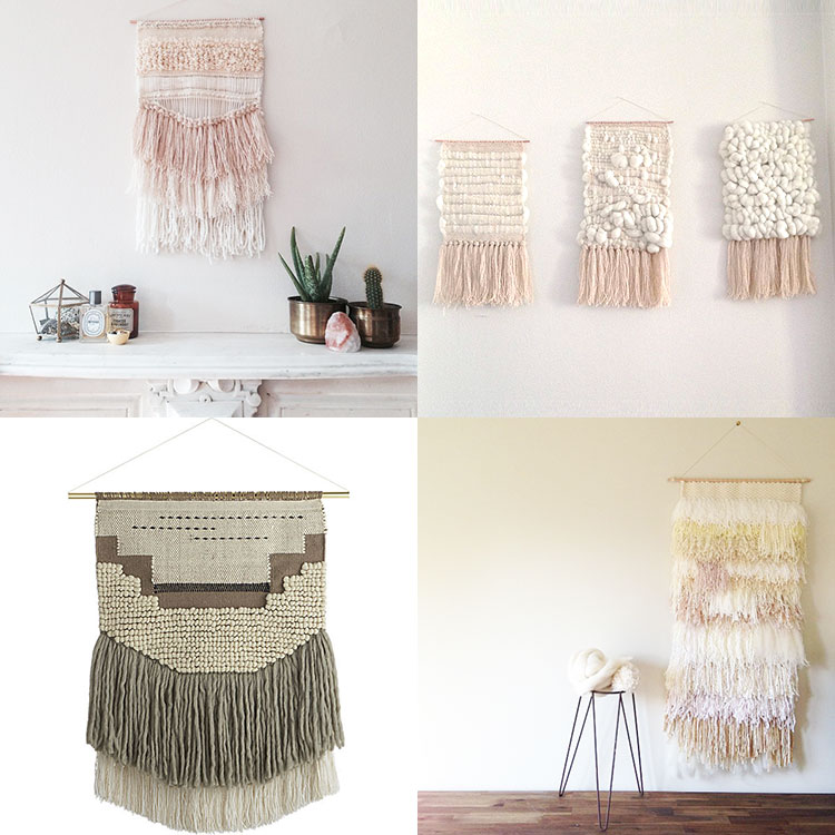
I have also recently become obsessed with woven wall hangings. The top two and bottom right are by incredible artist Maryanne Moodie. The bottom left I found at CB2.
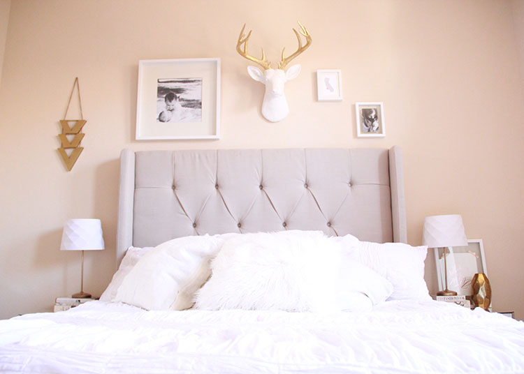
I’m really loving how this gallery wall of items is coming along above our upholstered headboard [which I got a while back at All Modern]. I had been searching for a faux taxidermy dear head for a while and I found this one from Mahzer & Vee when browsing Instagram one day and I ordered it immediately. I know the symmetry is totally off balance here and that’s because I want to add a plant hanging from a macrame plant holder on the right side corner there. Something like this:
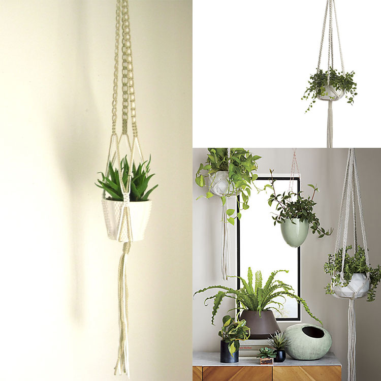
The left image I found via Etsy and the right two were from CB2.
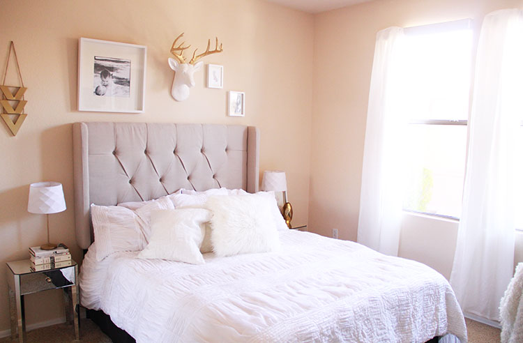
It’s pretty clean and simple, which is just what I was going for. Even having it in this state of closer-to-done brings me joy. I can’t wait to finish the last few little things!


