the ldl home: master bathroom reveal
It’s here! The latest here at the ldl home: our master bathroom reveal! As with all reveals I have done for our house so far, this feels like a “finally.” [I feel like I say that a lot!] I always have the best intentions to turn around these rooms quickly, but the reality is that real life is NOTHING like those reality makeover tv shows make it look. Ha! I’m also a perfectionist, so as I have said on here before, I feel like a room is never really “done.” But we have been enjoying our master bathroom, which feels very luxurious to my husband and I. We have always shared tiny bathrooms for as long as we have lived together and never even had our own sinks until now!
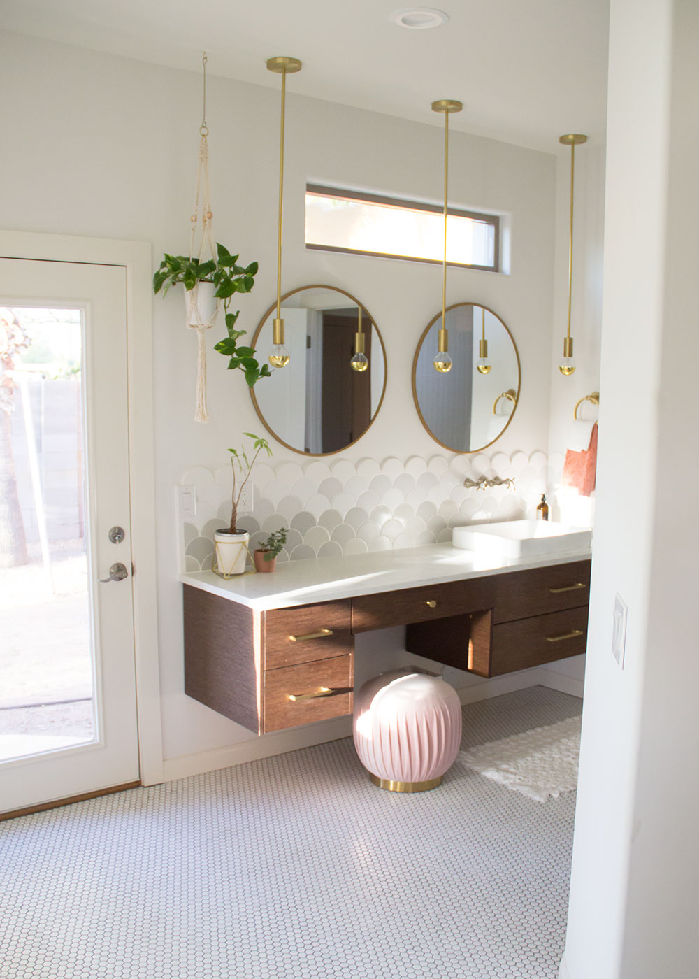
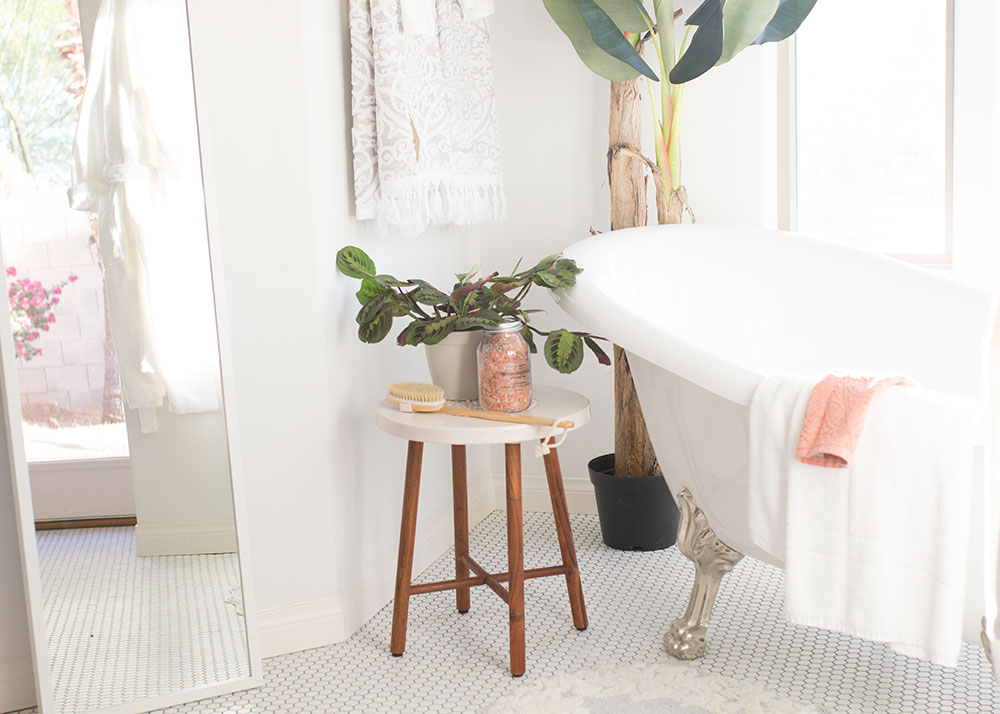
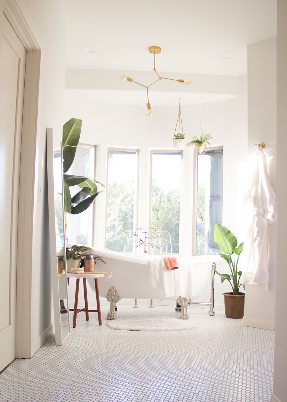
A little back story to how this area of our house came to be, if you haven’t been following along since the beginning. When we bought this house last year, this master suite addition was still in the studs, which was the same way it had been for more than 10 years! The previous owners started this addition but then never finished. So the good news was, in a lot of ways it was a blank canvas. We decided not to do any major changes to the layout though, since the plumbing had already been roughed in. The only changes we made were where some doors and interior walls landed. Oh and we took out all that hideous glass block! Basically we opened it up more so you could access the bedroom, bathroom, and my office from a small hallway, rather than having to wind through the office to get back to the bathroom. It’s kind of an interesting/unique layout too, which you can see a bit of from these photos!
[see the “before” photos in this post]
Let’s start with my design inspiration. I meant to do a seperate design inspo post prior to this one, but it was just another thing I never really got around to! Per usual, I started with Pinterest. You can see my bathroom inspo board here. I am, in particular, a huge fan of the designer Sarah Sherman Samuel. I just love her style and have a lot of pins from her designs on my Pinterest board. Her designs were a huge inspiration for me!
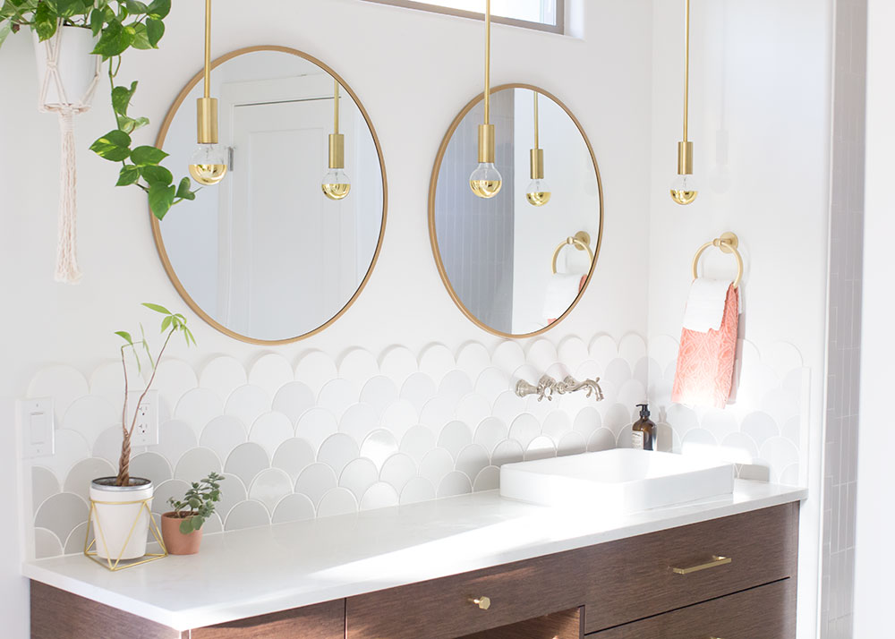
As we started to thinking about the design of this space, the standouts to me were floating cabinets, vessel sinks, and the round mirrors, gold accents and of course, lots of white. I also love plants and wanted to have a lot of fresh greenery in this space. It gets great light too, so it’s perfect for it!
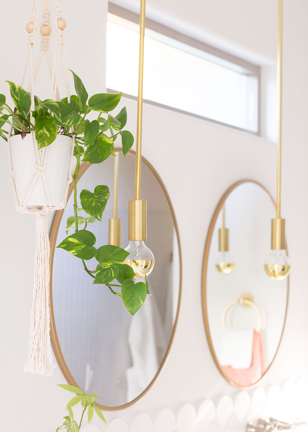
I started with the cabinets and we did a custom design with The Remodeling Firm. I already knew we would be using the same quartz material [the Tipperary from Arizona Tile] for these countertops as we did in our kitchen because we had some leftover.
After we had the vanities worked out, I moved on to the tile.
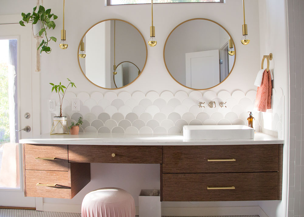
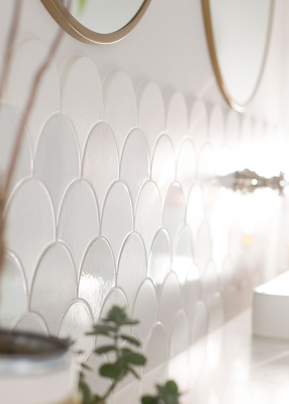
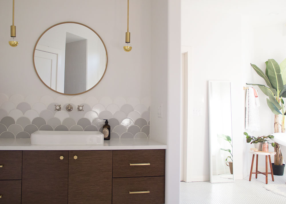
I just want to talk about this backsplash tile for a hot minute. When I was working on our kitchen with Fireclay Tile last year, I fell in love with this scallop pattern [called the Ogee Drop] in their showroom. I knew right away I wanted to incorporate it into our bathroom somehow. At first, I wanted to do it in a fun color, like a light blush or a cool blue hue. But per usual, I got nervous about doing color in such a permanent fashion. My original vision was also to have this tile going all the way up the wall. But in this part of the house we actually have 10′ ceilings, and with the handmade recycled Fireclay Tiles, that added up quickly!
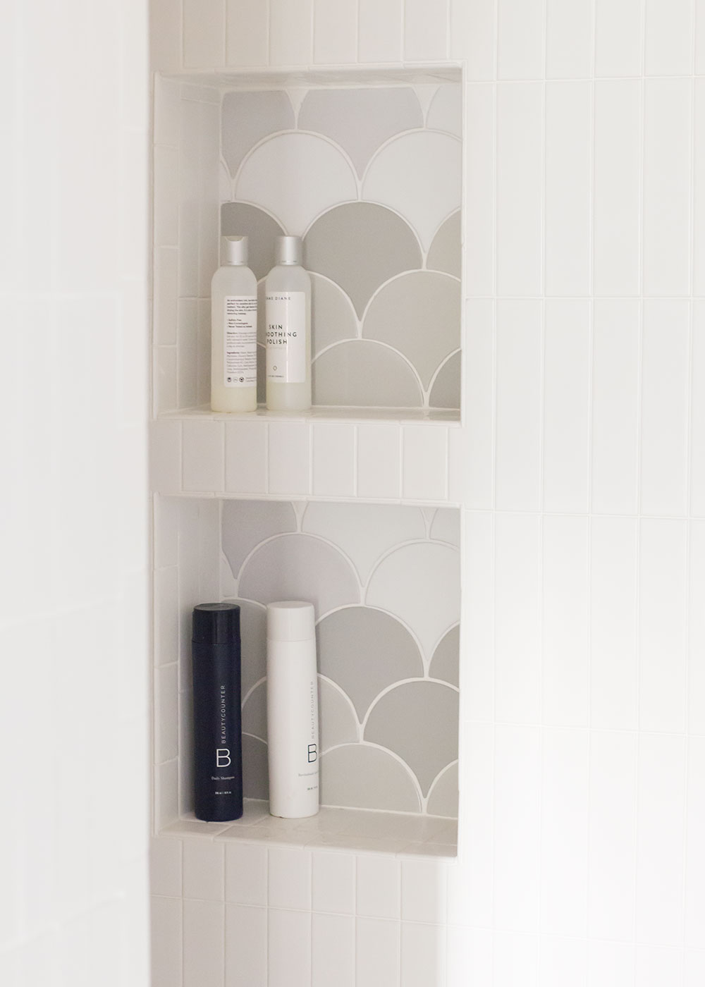
So then we decided only to go up part way, enough to cover the faucets. At first I thought I would just do a white tile and maybe choose a unique finish or something. But as I was working with my friend Terapan from Fireclay, he came up with a better idea. At first, we were going to do a random mix with this grey/white palette. Then we also considered an ombre effect. Then Terapan came up with the brilliant idea to do a ombre mixed pattern. You can also see in some of the photos how some of the tiles have a glazed finish and some have a more matte finish. We dubbed it “mermaid,” Which is really quite fitting, dontcha think?! I am 100% obsessed with how it came out!
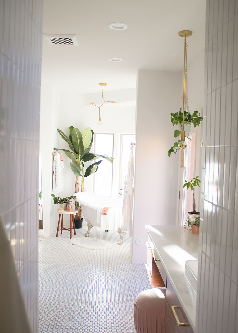

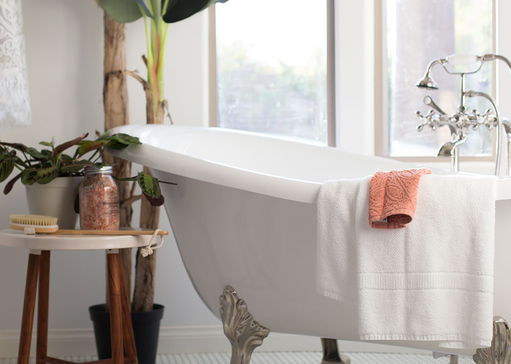
The tub in here is my other small obsession. If you watch my Insta-stories, some of you may remember that this area used to be all glass block, and the space was slated for a set in tub. The glass block was one of the first things I said had to go when we saw this house. And I am so glad we stuck with that because these windows are my favorite! I have always wanted a claw foot tub, and it took me forever to decide on the shape, size, and material I wanted. But this one from Victoria + Albert checked all the boxes for me!
I’ve had a lot of questions about it so I thought I’d share a bit about what I learned in the process of researching tubs. For a freestanding tub, neither my contractor nor my interior designer sister recommended acrylic. This is because acrylic just does crack eventually. In a set in tub, there are ways you can prevent this, but for freestanding the pressure will eventually get to it. So most people recommend either a cast iron [which is ridiculously heavy] or this Victoria and Albert one is made from a volcanic composite. Even our plumbing contractor said that ours was one of the nicest tubs he’s installed in a long time, and not necessarily the most expensive! If you go this route, it’s one you will have to order through a showroom like Ferguson,where we ordered ours. You can for sure find cheaper ones from places like Signature Hardware that are acrylic. But just be prepared that you will have to replace it at some point!
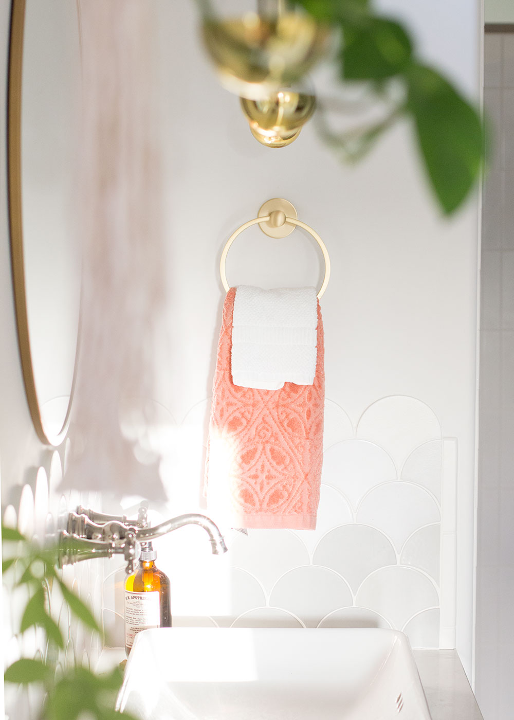
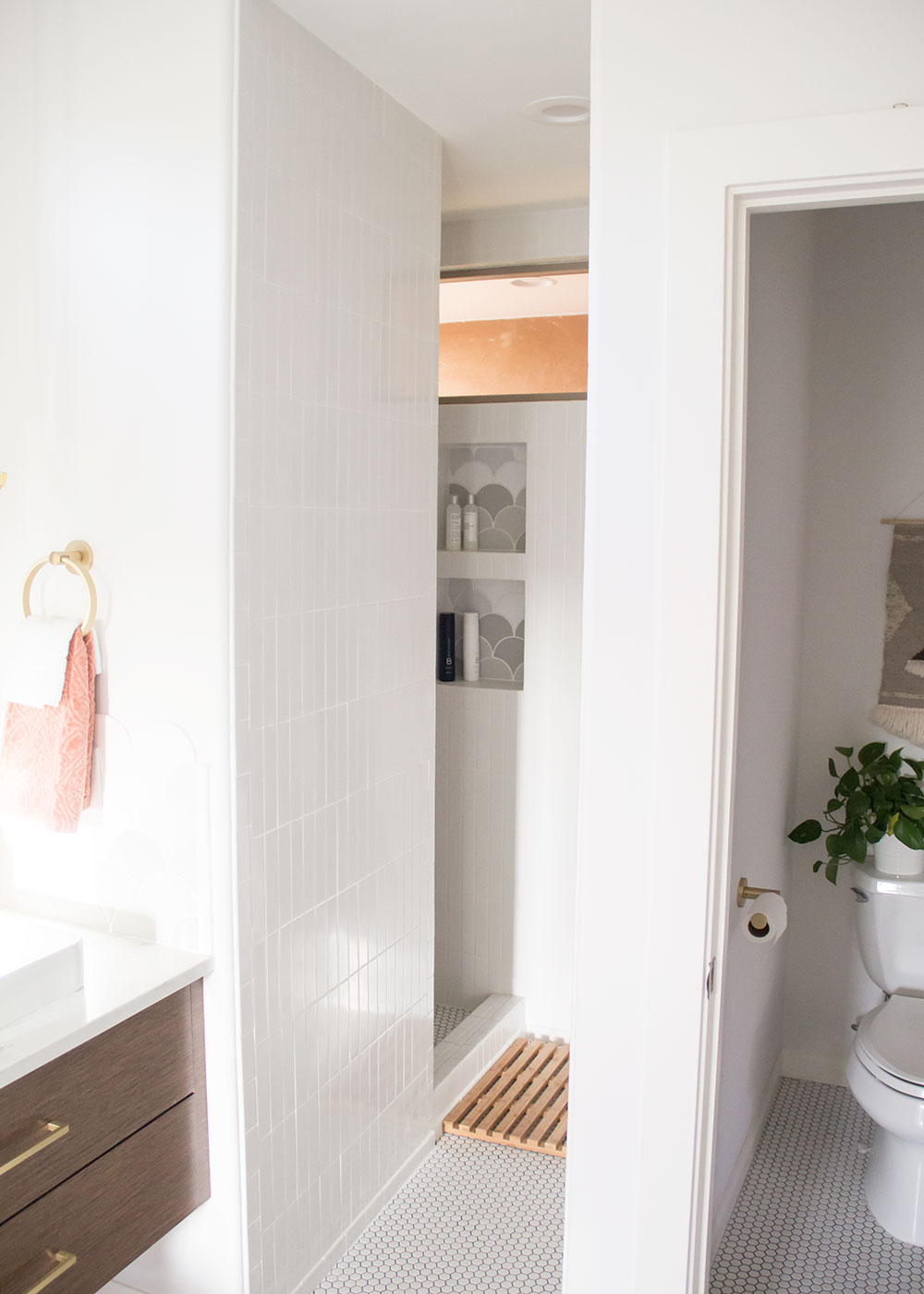
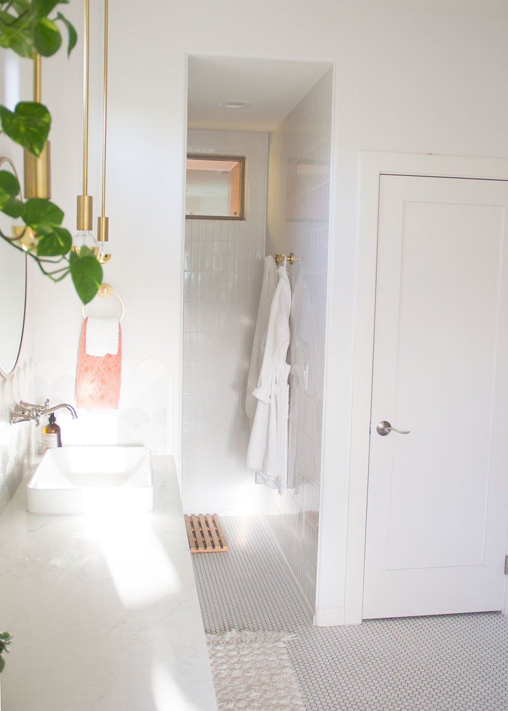
I am going to try to link everything else I can think of here for you now! If I’ve missed anything, as always, please let me know in the comments and I will update it in the post!
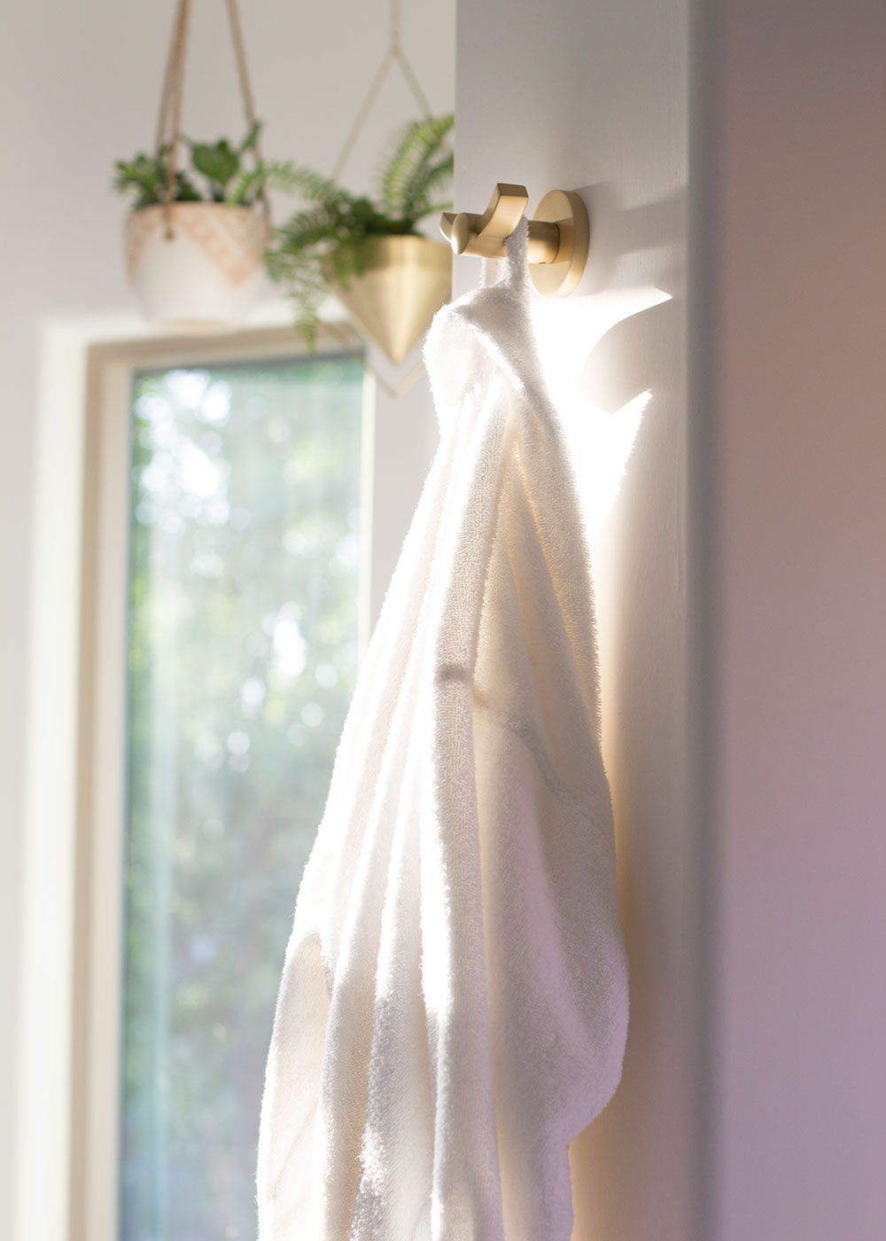
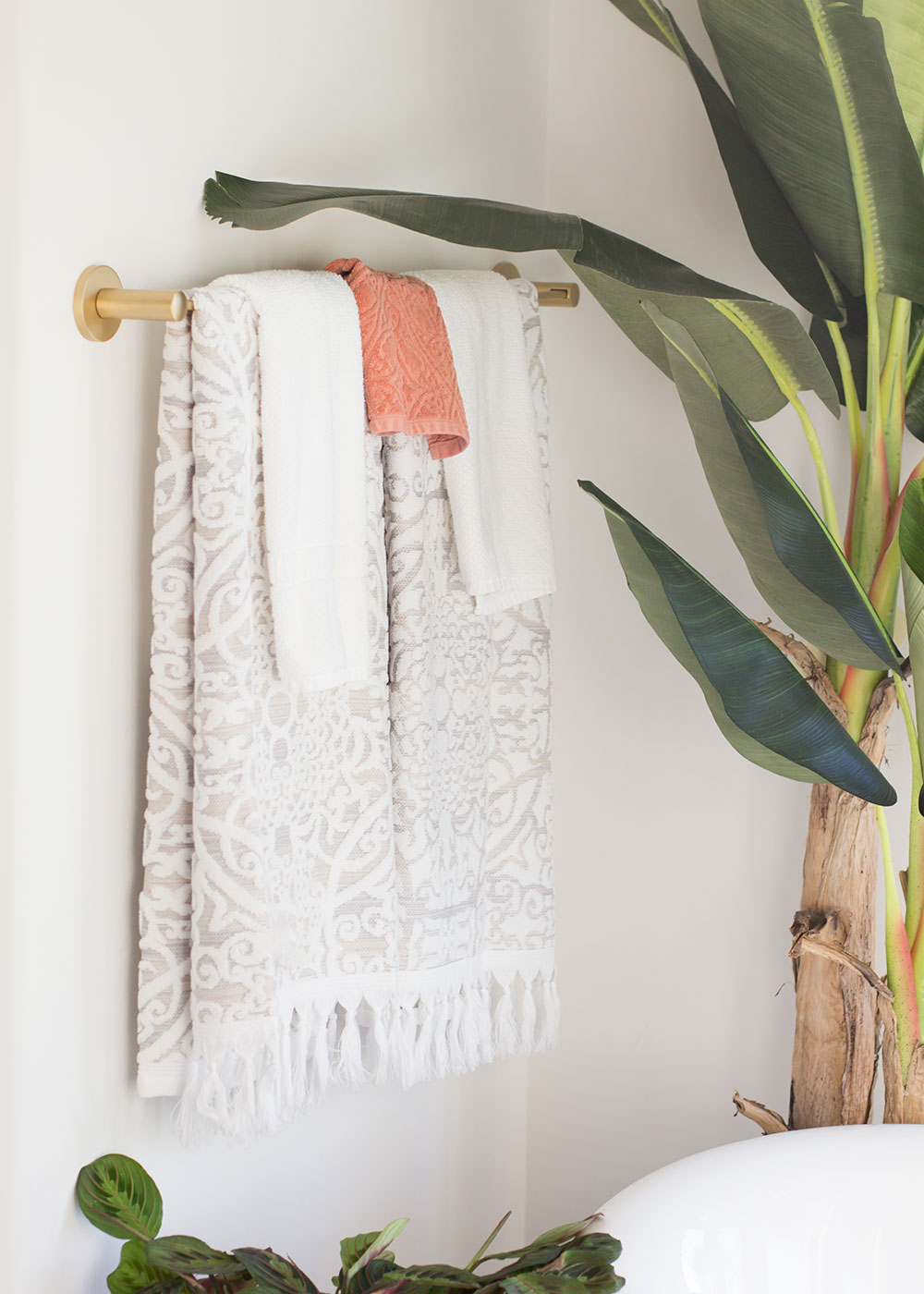
towel bars and hooks
This post contains some affiliate links. Thanks for supporting the brands we love!


