the ldl home: an awkward corner
This post was created by me in partnership with Article. As always, all opinions expressed here are my own.
I am very excited to share today the latest reveal at the LDL home: an awkward corner of our home that has been plaguing me from the the time we first bought the house!
Let me start by explaining a little history of this space. In the original footprint of the home, this was most likely used as a formal dining room, or maybe a sitting/living room. Our house was originally a 70s ranch home, with small, sectioned off rooms. The previous owners did a lot of work to it over the years they lived there, so although the house had a ton of potential, there were some aspects of it we just had to work with.
The house was more or less a blank slate, as the previous owners had started a big addition that was still in the studs, but never finished.
See the full original house tour, as we bought it, here.
They had also began ripping out all the flooring, but again left unfinished. On the interior in this corner, they also planned for a pass through in this former “room” through the original exterior wall to the new addition of the home (see below photo where the glass block windows were). This now leads through to the finished master bedroom, master bathroom, and my office. When we came in, we also knocked down that wall you see to the left in this photo to create the open concept living we had always dreamt of.
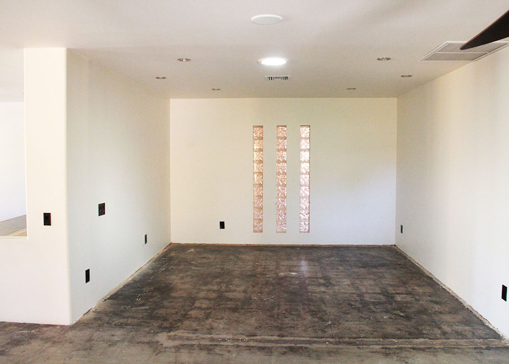
On the other side of the adjacent wall is our laundry room. We really wanted to expand it into this space, but budget constraints did not allow. So we left it as is, as we also didn’t want to invest in built-ins or anything that we would eventually have to rip out when we do expand the laundry room.
When we first moved in, we were still finishing the addition part of the house (where my office is now), so this corner was used as my office.
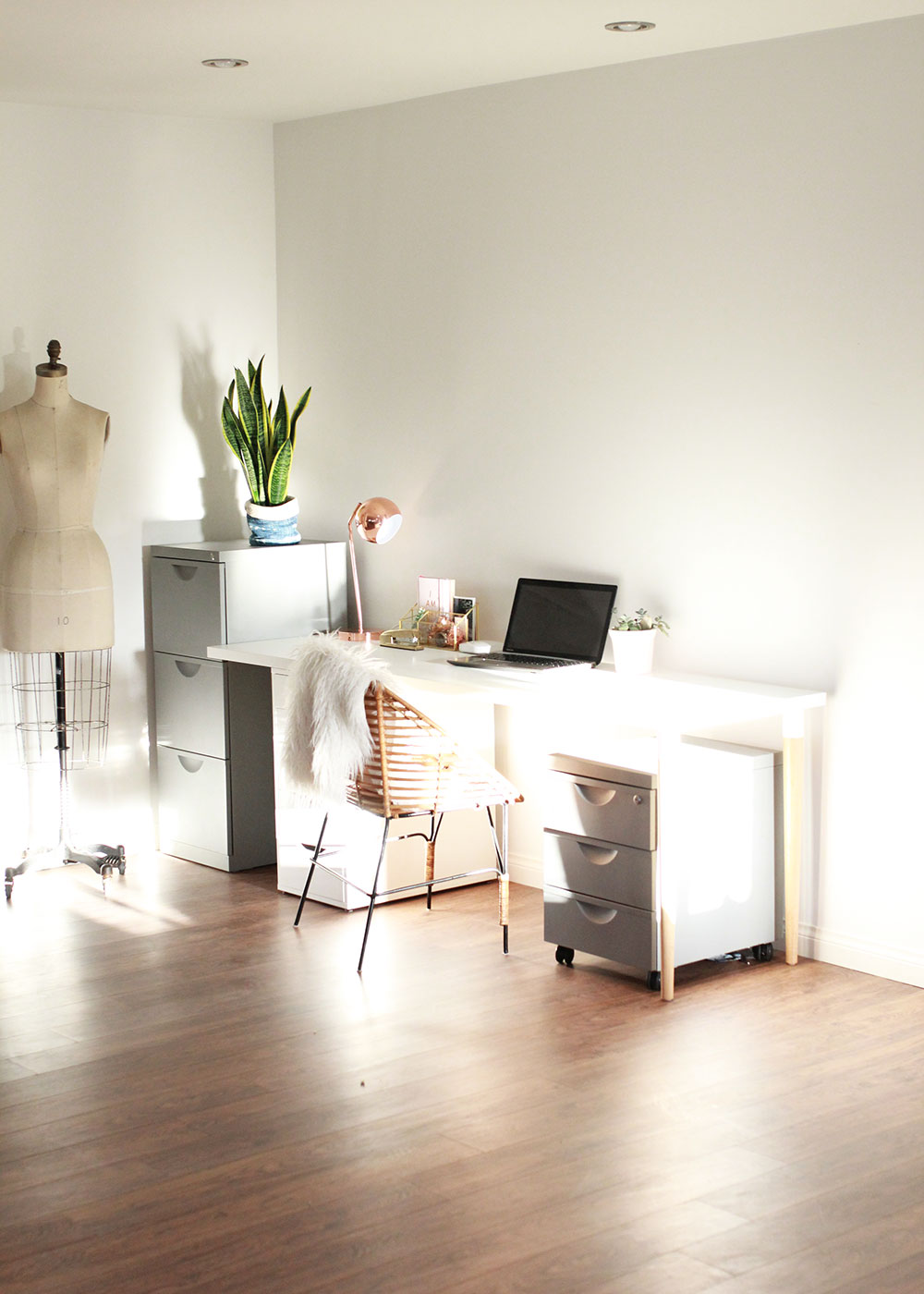
After we moved my office, I was befuddled with what to with this narrow and awkward corner. To the left of this view is our living room, which also opens up to the kitchen. And to the right, is our dining room, which you can see the full tour of here. I had dreams of creating a gallery wall, but gallery walls are hard, guys! For a long while we kept our old sideboard here, which I did not love at all, but it was functional for keeping our formal china we got for our wedding. I knew I wanted to get an updated piece that could serve the same purpose.
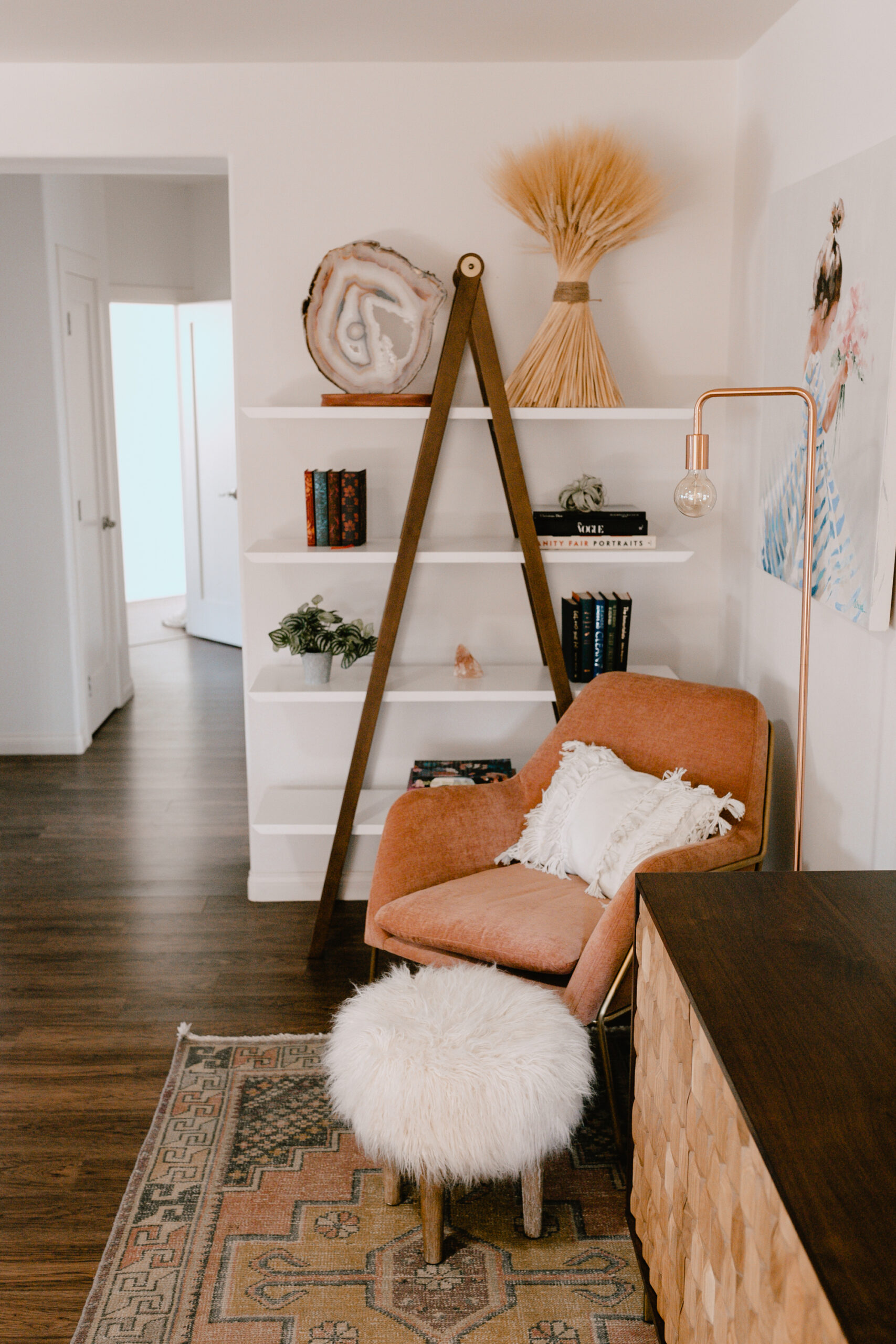
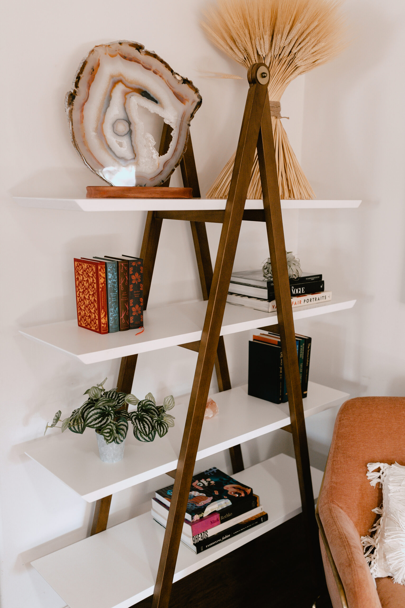
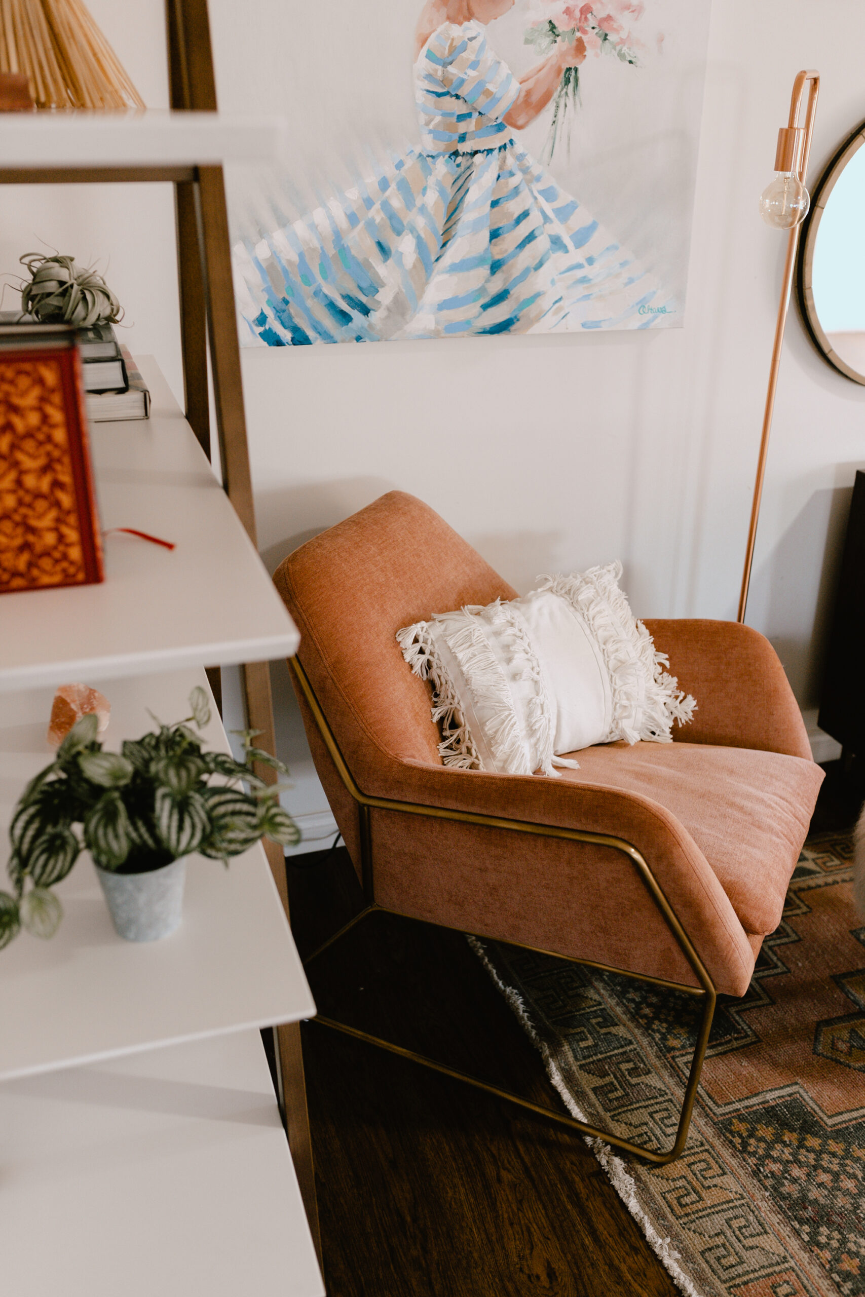
Eventually, I enlisted the help of my sister, who just so happens to be a brilliant interior designer. She is the one who suggested a comfy chair, a lamp and maybe some greenery. I found this vintage runner a while back too, and knew it would live here eventually. When I found this beautiful Caliper Shelf piece from Article, and it measured to fit exactly into this space, I knew I finally had something coming together!
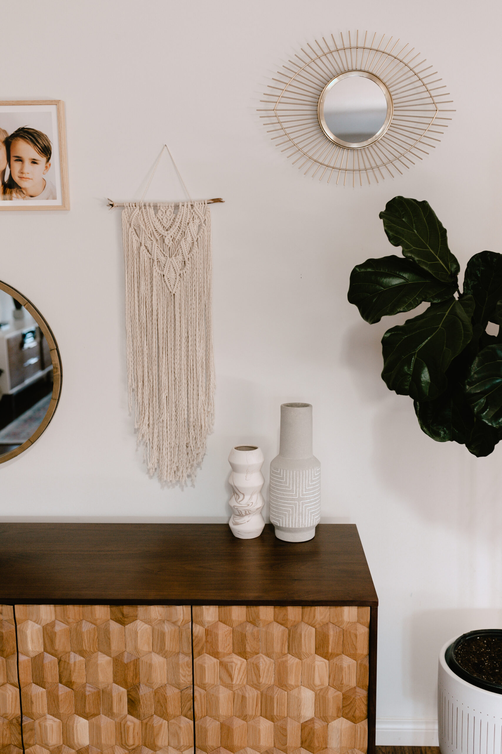
I am obsessed with the Geome Sideboard by Article you can see here! I love how it feels modern, without being as fully mid-century modern, as many of the other of the pieces in our home. As always, the quality of the pieces we got from Article are incredible – beautiful solid wood with quality hardware and construction.
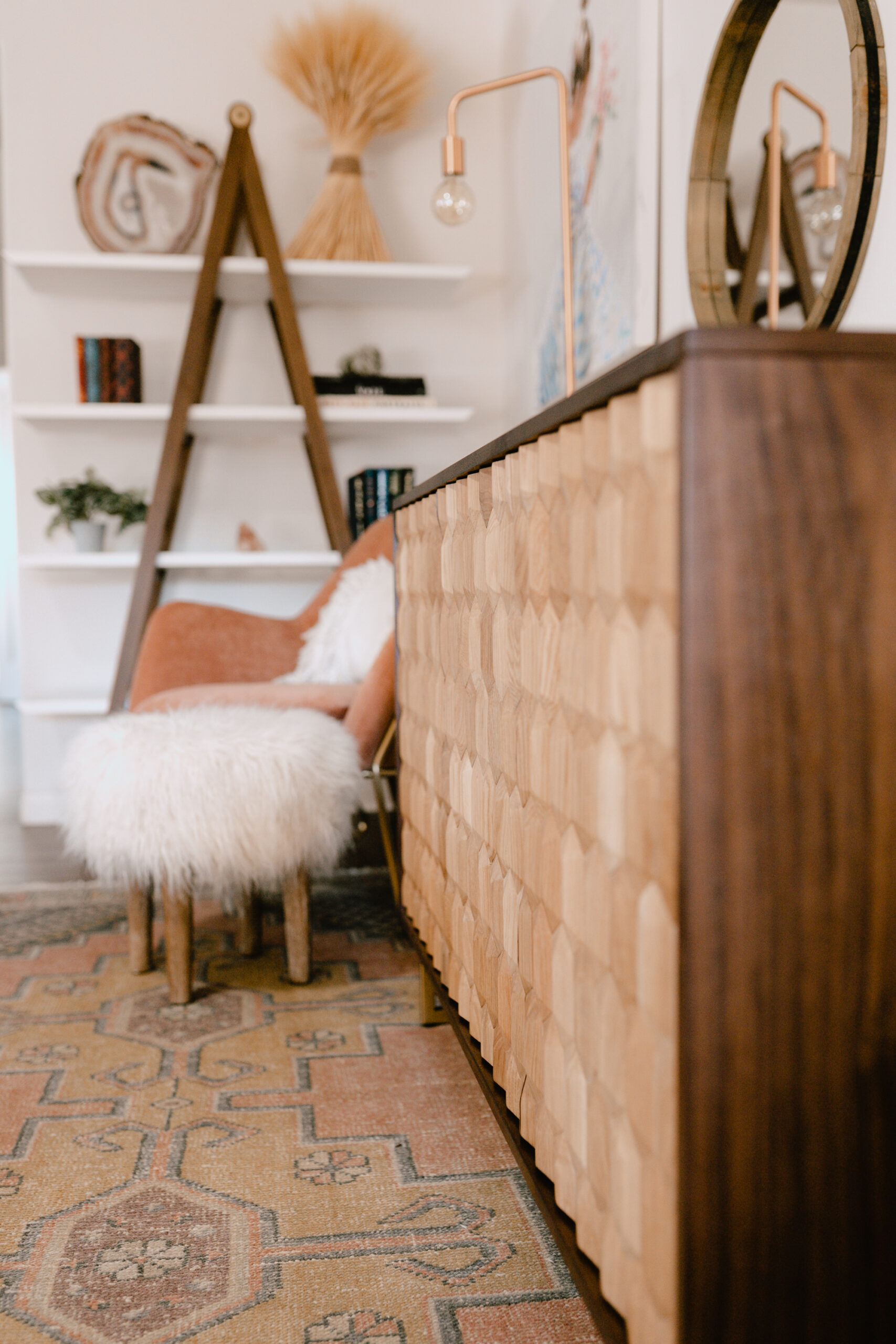
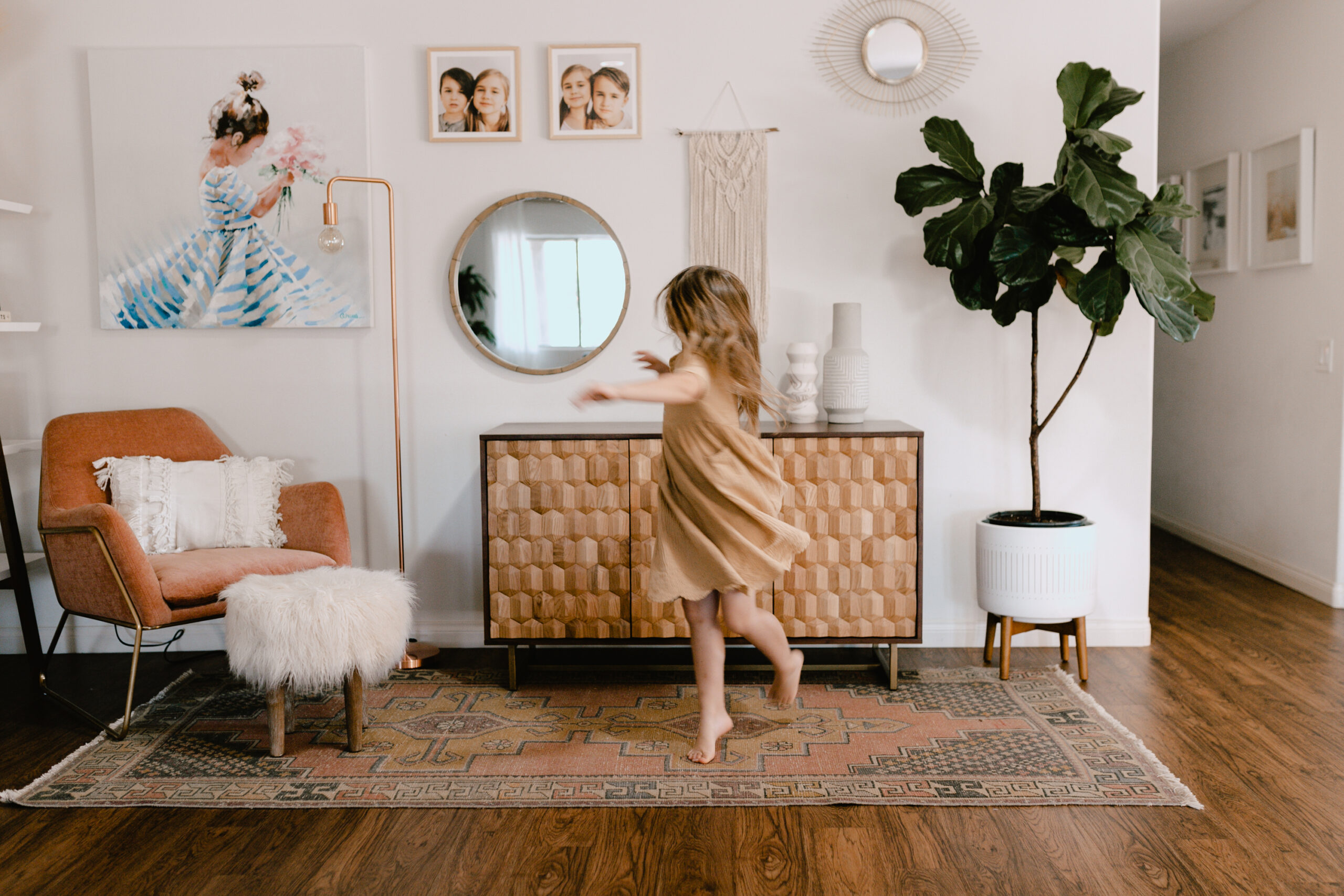
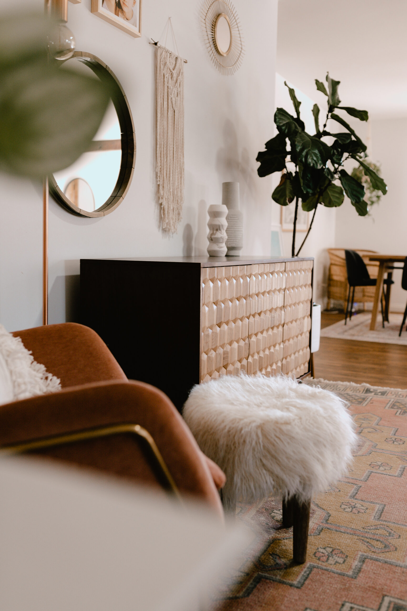
Also have to call out this new favorite reading spot in the house: the Forma Chair from Article. It also comes in a space blue, but this sunrise pink with the gold details was just calling my name from the moment I saw it. I am loving how it pulls in the colors of my vintage rug!
I paired it with this simple, yet statement Beacon Floor Lamp in copper, which perfectly complements or other mid-century/industrial lighting fixtures in the house. When I first started picking hardware and lighting three years ago, it was so hard to find copper, so I’m really loving that it’s on trend now!
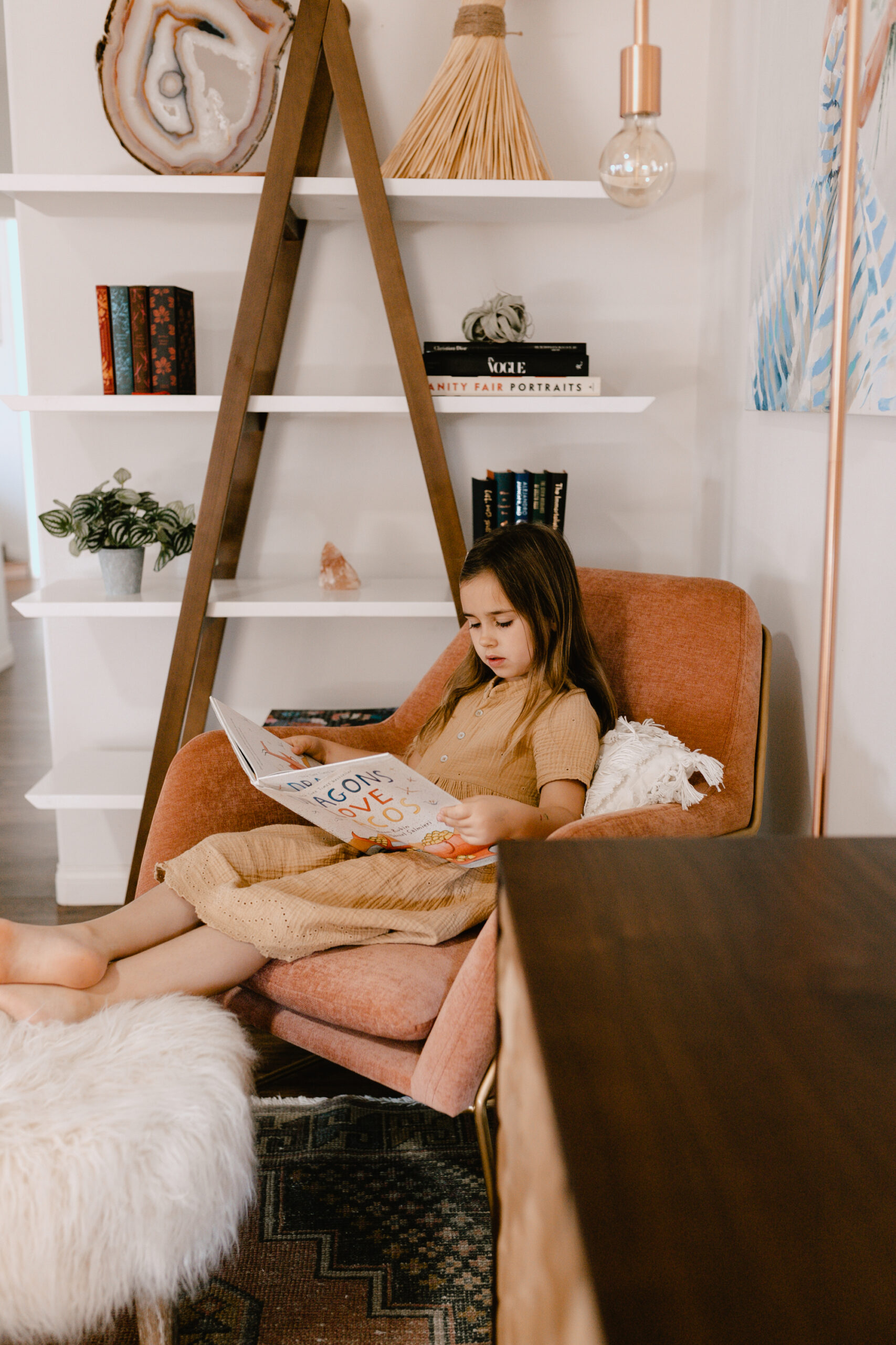
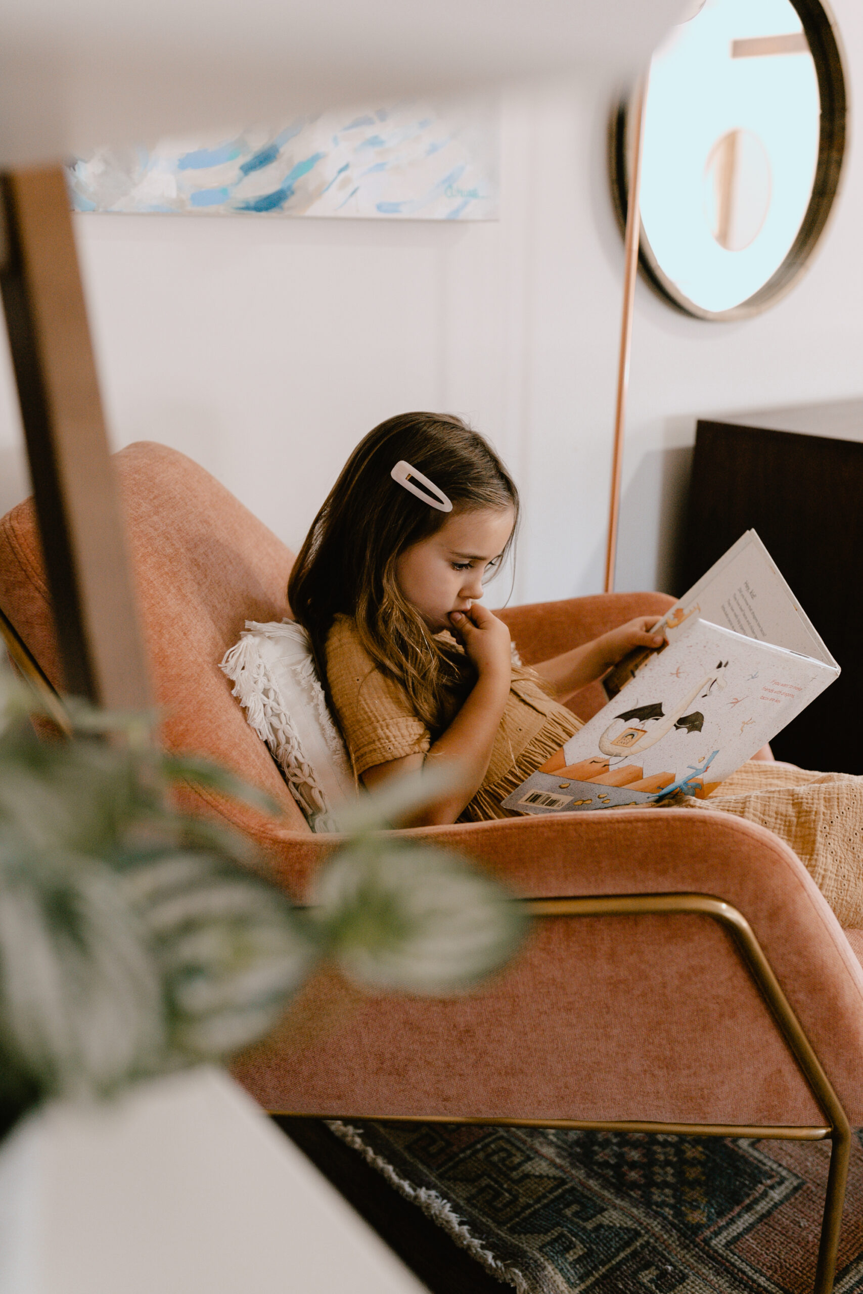
I’m so thrilled that this awkward corner in the LDL home FINALLY feels finished! What do you guys think? What would you have done here, given the blank slate we started with? I love hearing your ideas – share in the comments below!
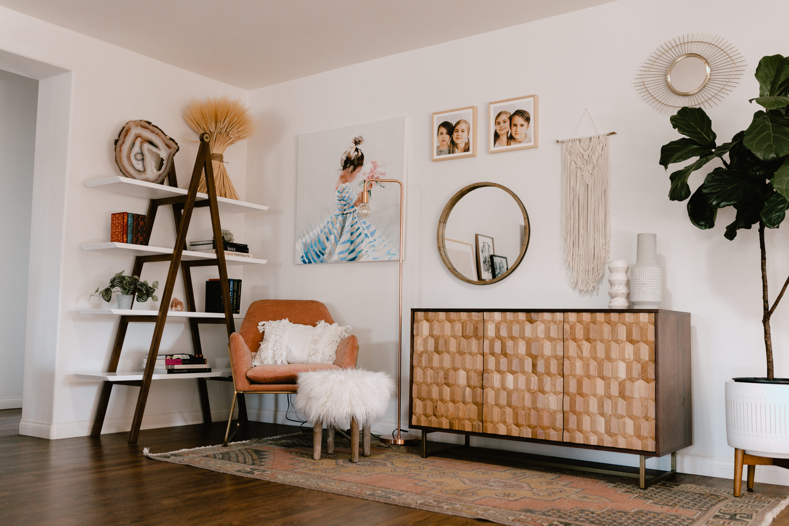
sources:
forma chair c/o article
beacon floor lamp c/o article
geome sideboard c/o article
caliper shelf c/o article
kilim vintage rug from apple & oak nashville
original custom painting by @amykavs
original macrame wall hanging by @wovenbyro

